Design thinking embedded in irreverent imagination. Crystallised by artistic direction. Powered by conceptual ideation – a creative practice by Hedieh Anvari; an admirer of the amorphous & its possibilities.


Menstrual Cycle Poster Design Series I
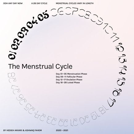
Numerical Design representing each phase of the menstrual cycle. A multi-phase design study
that brings menstrual cycle to the forefront of design thinking and design education.
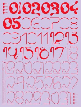
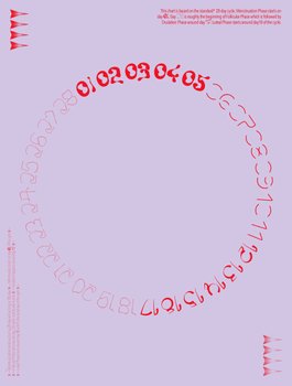
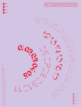
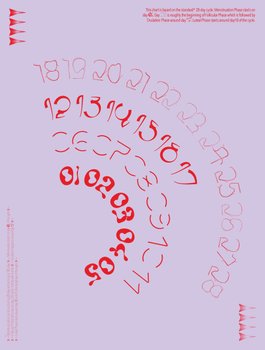
Phasal Numeral Design THREE – ‘A Regular Menstrual Cycle’
Numerical Design representing each phase of the menstrual cycle. A multi-phase design study
that brings menstrual cycle to the forefront of design thinking and design education.
As someone who has studied graphic design and typography design it has been of great surprise that no designer have dedicated their time and design skills to bring the system of the menstrual cycle. Throughout the history of graphic design, systems, the calendar, the seasons, way finding and information design have been subject of focus for improvement by applying design principles. The menstrual cycle – a key system that follows more than half of the world's population and my have impact on the other half – has not and still doesn't seem worthy of study.
The Menstrual Cycle Numerical design is one of the long running design studies of Ooh Any Day Now.
The series of design aim to give voice to one integral machinery behind the everyday life of girls, women and menstruating people. However, the vast majority of people are unaware of the four phases that the menstrual cycle is comprised of. The consequence a continued dearth in knowledge of their effects and benefits.
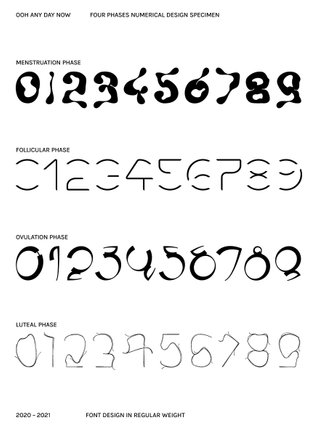
The four different numerical design presented are the third and final outcome based on the general characteristics of each phase. Although, consistency and basic application of grids and systems are the key foundation of font design, they have been intentionally given less importance, only to mirror the organic transitions and varying length of the cycle and its phases.
The research phase was simply relied on knowledge provided on medical platforms along with our own experience by going inward and pay active attention to our body signals. This helped to capture and provide fitting identity for each phase of the cycle – something I have done numerous times for brands and campaigns.
As part of the process of defining the identity of each phase catchy names that encapsulate their attributes were considered for each font design, however this idea was quickly deserted only not to perpetuate generational and cultural 'hush-hush' approach of referring to the period with nicknames and code words. As such, The fonts are simply named as followed: Menstruation Phase, Folicullar Phase, Ovulation Phase and Luteal Phase. This decision brings the outcome to its original purpose and mission – education. By Hedieh Anvari
3D Creation & Animation by Sofia Wang
A few words on the characteristics of the design:
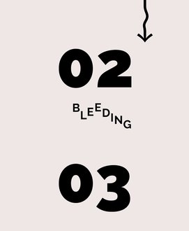
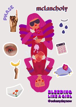
Menstruation Phase design with its imbalanced roundness and shapelessness brings to attention the psychic and physical sensations of the menstruating days.
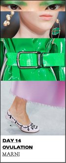
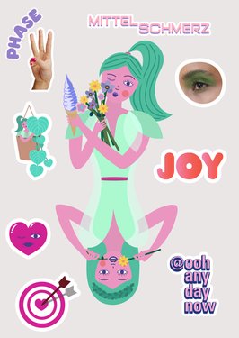
Follicular Phase design is the most symmetrical of the four with an open body which gives the lightness that is know but unfortunately unrecognised by many.
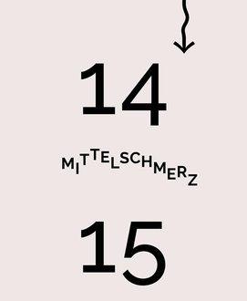
The very rounded Ovulation numerical design encapsulate the time when nature does its best to ensure women feel incredibly fertile with the libido at its peak. The pointy details are to represent the sharp pain – Mittelschmerz – that occurs mid cycle due to the enlargement of the released egg.
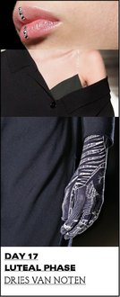
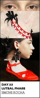
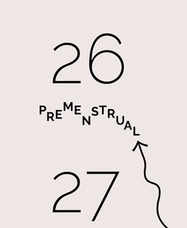
The Luteal Phase numerical design consists of gravity defying light layers that are being peeled off. This phase is the longest and with a paradoxical nature. It ends substantially differently to how it starts. By Hedieh Anvari
Concept & Font Design Direction by Hedieh Anvari, Font Design assisted by Ashwaq Fahem
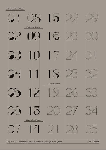
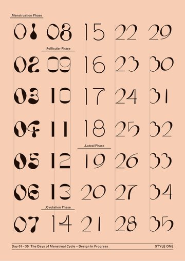
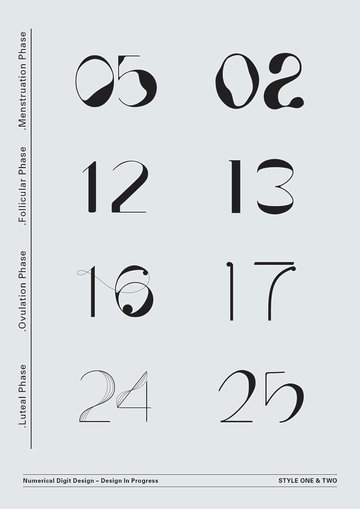
Phasal Numeral Design ONE & TWO – ‘Testing Cycles’
A multi-phase design study and exploration of how the cycle can be represented.
The first round of the font design studies, initiated in 2019 with analysis of classical letterforms and numerics along with less conventional typefaces. This analysis was along and analysis of the visceral by journalling the different ranges of sensations that go hand in hand with menstrual cycle phases. By getting to know the specificities of each phase and philosophising about them in relation to typeface anatomy. The process became rather extensive and underwent rounds of design explorations and iterations.
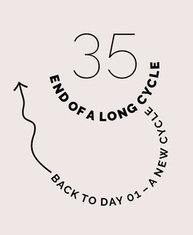
Above are posters showcasing a 35 day cycle – many days longer than the generally known 28 day cycle. It is worth to note that experiencing cycles longer than 35 days are to to be discussed with your doctor.
This multi-phased process is soon due to complete another creative outcome. By Hedieh Anvari
Concept & Font Design Direction by Hedieh Anvari, Font Design assistance by Li Libo
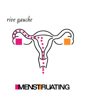

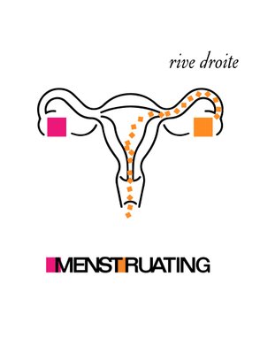
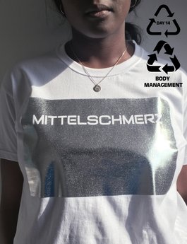
‘Rive Gauche, Rive Droite’
The egg passage – know your left from your right.
We know by now that the release of the egg from the follicle and ovary happens and you might notice a slight pain not too dissimilar to period pain and there's a subtle rise of body tempretaure.
Ovulation alternates between the left and right ovary for about half of women and this can be detected.
Rive Gauche (left river) historically refers to the chic neighbourhoods of river Seine in Paris. This was taken as the influence and inspiration along with Yves Saint Laurent's Rive Gauche legendary logo design.
A winking reference to
A river stream from left ovarie through the Fallopian tube
On an early autumn Sunday we headed to Bricklane, London to get the attention of young women whether they would want to pose with the 'Menstruating rive gauche' t-shirt. And as a thank you for their time, they were given the t-shirt. I hope the brief interaction could impart some knowledge...
Concept, T-shirt Design & Creative Direction by Hedieh Anvari


Studio Cravings – GARMENT CRAVING
What is it that makes you, time after time returning to the same garment, among all the other carefully designed and crafted pieces bought with hard earned money?
Peculiarly, every month, on the first days of my period – the Follicular Phase, I find myself opting for white garments. Perhaps not so clever but I can't really help myself as it's soothing on some level, as I feel slightlly heated with a body temprature higher than rest of the month!

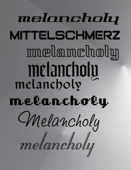
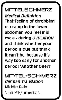
Mittelschmerz
Sharp pain – Mittelschmerz – that occurs mid cycle due to the enlargement of the released egg.
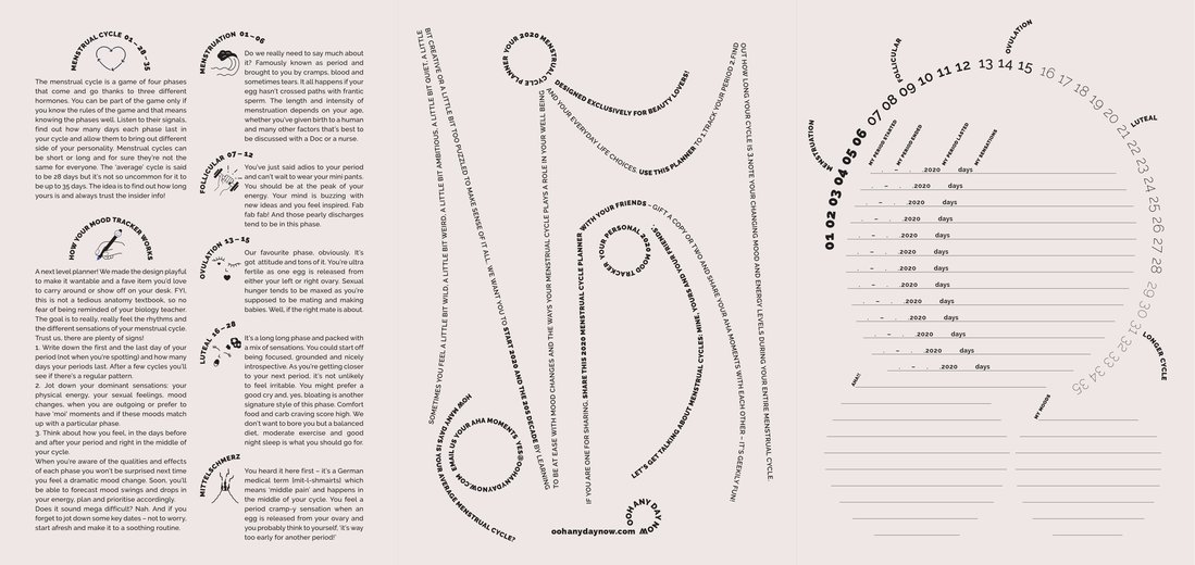
Menstrual Cycles Printed Planner
Take your time & jot down some notes about how you feel and what you sense

Portrait of the Four
The four protagonists of the Menstrual Cycle.

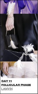
Folicular Phase Mood & Character